Creating a website should feel simple. But for most small business owners, it starts out confusing and quickly turns overwhelming. As someone who offers custom showit website design for creatives, I see the same issues come up again and again.
Here are the three website mistakes I see most often, and some clear ways to improve them.
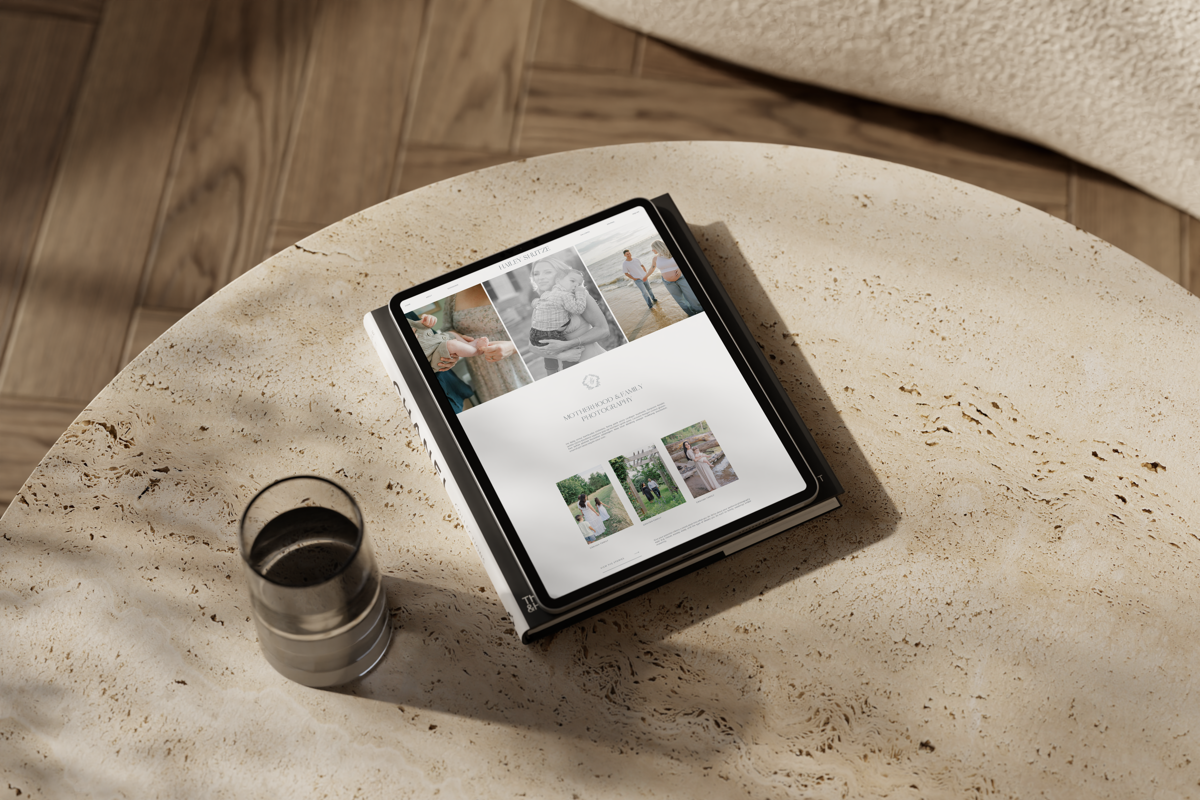
1. Overcrowded Website Design That Confuses Your Visitors
Most websites feel busy before they feel helpful. I see a lot of homepages that try to say everything all at once. The problem is that too much information, all layered together, creates friction. Visitors stop reading. They lose track of what to do next. And when that happens, they usually click away.
How to fix it:
Start by thinking of your website like a conversation. One section should lead to the next in a calm and intentional way. Break things up with clear headlines, simple text, and visual space to breathe. Use Showit to create focus areas that naturally guide someone through what you offer. A custom website design can do this by making each page feel organized, not overloaded.
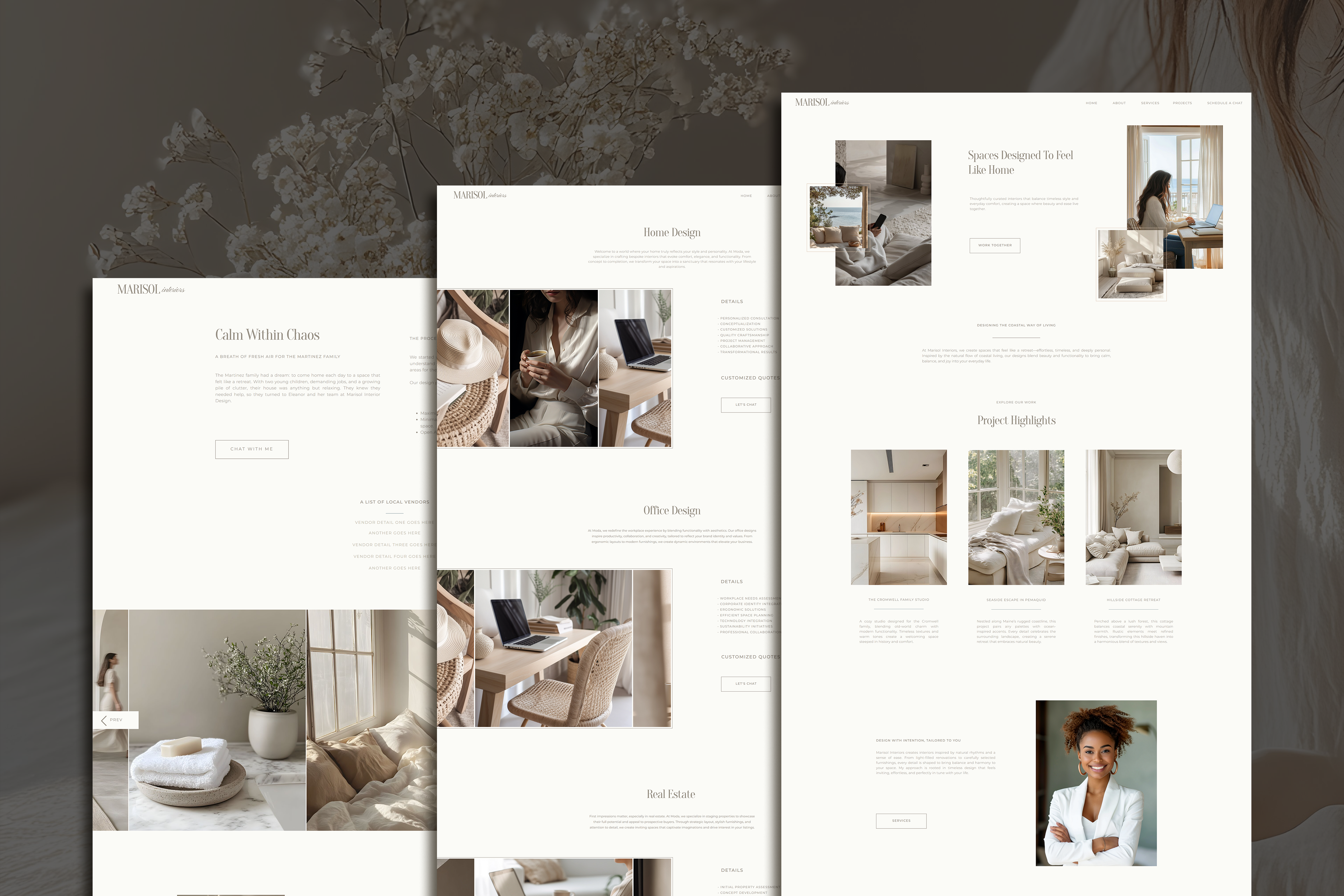
2. Website Pages Without a Clear Next Step
A lot of small business sites look beautiful, but they leave people wondering what to do. I often see pages with no clear next step. No button that says where to go. No encouragement to connect, book, or learn more. This turns a potential client into someone who clicks away without taking action.
How to fix it:
Every page needs a purpose. That might be booking a service, filling out a form, or exploring a portfolio. The most helpful websites tell people exactly what to do. Add a clear button or call-to-action that supports your business goals. If your goal is to build trust, invite them to read your story. If your goal is to book clients, lead them to your contact form. With a custom design, this can be mapped out from the start so nothing is left unclear.
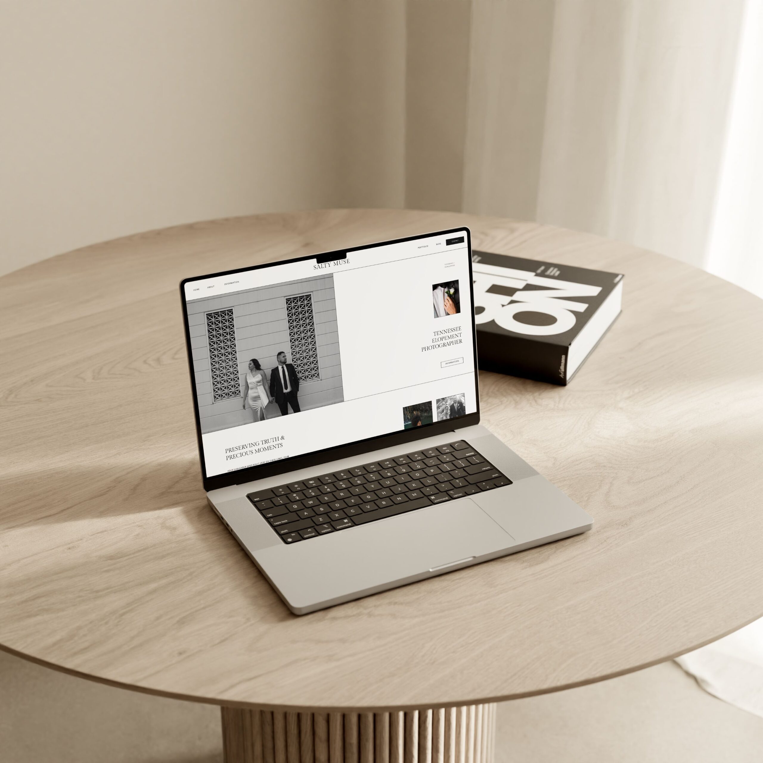
3. Custom Website Design Should Feel Easy to Use
Aesthetic is important, but your website needs to work well too. I see a lot of beautifully styled websites that are hard to use. Maybe the font is too small, or the text is hard to read. Maybe the menu is hidden. Or maybe it looks nice on desktop, but doesn’t work well on mobile. These design decisions can quietly turn people away before they ever reach out.
How to fix it:
Good design should feel effortless to the person using it. Your site should load fast, flow smoothly, and feel aligned with your brand. When I build websites for clients, I focus on layout, legibility, and clarity. A simple site that’s easy to use will always perform better than one that’s only styled to look impressive. Showit is a great platform for this, especially when paired with intentional design choices from the start.
Final Thoughts
Your website doesn’t need to do everything. It just needs to clearly show who you are, what you offer, and how someone can take the next step. If yours feels heavy, scattered, or hard to update, you’re not alone. These fixes are simple, but they can completely change how your business shows up online.
I’m currently offering a few free 3-page custom website designs for small business owners who want something minimal, clear, and built around their brand. If that sounds like something you’ve been waiting for, you can learn more at Salt Loft Studio.
CLICK HERE TO VIEW MY CUSTOM SHOWIT WEBSITE SALE
MY ETSY SHOP – Shop ’till you Drop!